Reporting UI bugs shouldn’t feel like creative punishment. It should feel like finishing the job.
Table of Contents
- The Cost of Skipping Design QA
- Why I Built DesignQA After 17 Years in Design
- What Is the Design QA Process?
- Why Design QA Still Sucks in 2025
- A Modern Workflow for Designers Who Understand Code
- “Do We Really Need Another Tool?”
- How to Actually Do Design QA – A Practical Guide
- Real Numbers From Real Teams
- Mini Case Study: The 7-Pixel Checkout Bug
- What Devs and PMs Actually Want
- FAQs About Design QA
- Next Steps: Try DesignQA and Ship With Confidence
The Cost of Skipping Design QA
Picture this:
Your new checkout flow goes live.
The hero button on mobile?
Seven pixels lower than it should be.
Your dev swears it’s fine. The PM swears it’s broken. Users just think your product feels… off.
These are the small details that slowly erode user trust — and they happen all the time when the Design QA process is rushed or skipped.
Why I Built DesignQA After 17 Years in Design
For the past 17+ years, I worked as a product designer at early-stage startups and high-growth teams around the world — from Jordan and Dubai to Amsterdam, Boston, and San Francisco.
I’ve led design teams, worked closely with PMs and engineers, and shipped more than my fair share of messy handoffs and overlooked bugs.
Last year, I quit my job to go all-in on a problem I couldn’t stop thinking about:
Why is reporting UI bugs still so manual, clunky, and inefficient?
So I built DesignQA — a lightweight Chrome extension that helps teams compare what was designed in Figma to what was actually built on the web.
What Is the Design QA Process?
The design QA process is the step where you check that your implementation matches the original design — visually, functionally, and structurally.
A good process catches:
- Spacing and alignment issues
- Typography or color mismatches
- Incorrect design token usage
- Missing states or interactions
- Component inconsistencies
- Copy mistakes or UX regressions
It’s how you protect your design quality before users experience friction.
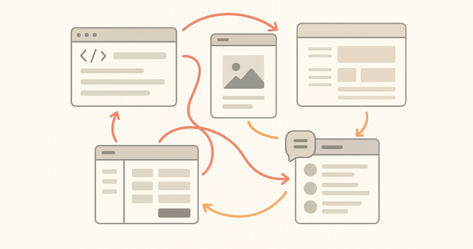
 A quick visual example of the design QA process in action.
Why Design QA Still Sucks in 2025
Despite all the tools we have, UI bug reporting often looks like this:
- Open dev tools
- Take a screenshot
- Annotate it in Figma
- Write a Jira ticket
- Ping the engineer
- Hope it gets fixed this sprint
Multiply that by 5–10 issues per feature and it’s no wonder designers spend 2+ hours per week just reporting design bugs.
And engineers? They often get vague tickets with no screenshots, no context, and no clear fix — so bugs linger.
 The old way: a messy mix of tools, screenshots, and endless messages.
A Modern Workflow for Designers Who Understand Code
I’ve always been a designer who codes — not because I had to, but because it helped me work better with engineers.
Here’s what that workflow looks like today:
- Design tokens in Figma that mirror the Tailwind or system tokens devs use.
- Functional components built using AI tools like Cursor, Bolt, or Lovable.
- Minimal friction at handoff, because implementation speaks the same language as the design.
- DesignQA closes the loop, ensuring the shipped UI matches what we intended.
“Do We Really Need Another Tool?”
That’s the first question PMs and designers ask me.
And I get it — nobody wants bloat.
But DesignQA isn’t just another tool — it’s an invisible Chrome extension that lives in your browser until you need it.
- No new dashboards
- No long setup
- No context switching
- Just click, compare, report — done in seconds
The result? Designers go from 2 hours/week bug reporting to 20 minutes.
Devs get precise, actionable issues.
PMs see consistent quality.
How to Actually Do Design QA – A Practical Guide
Here’s how to run the design QA process efficiently with DesignQA:
1. Start Early
Before dev starts, align with your PM to add Design QA time into the sprint.
2. Align Tokens
Use design tokens in Figma that match your codebase (especially if using TailwindCSS).
If you’re not doing this, read The Art of Design Spec’ing and What Is Design QA? to get the full context.
3. Run Your QA Pass
Select mismatched elements with DesignQA. It auto-captures a screenshot, compares it to Figma, and shows differences in red.
4. Prioritize Issues
Group bugs by severity:
- High: UX blockers
- Medium: Token mismatches
- Low: Minor spacing issues
5. Create Clear Tickets
Each report includes:
- Screenshot
- Page URL
- Design vs. code values
- Suggested fix
 A bug report devs can actually use — no detective work required.
6. Verify Fixes
When devs are done, rerun the check. All green? Ship it.
Real Numbers From Real Teams
After speaking with dozens of designers at startups:
| Metric | Without DesignQA | With DesignQA |
|---|---|---|
| Time spent reporting bugs (per week) | 2+ hours | 20 minutes |
| Bug clarity for engineers | Low | High |
| PM satisfaction with quality | “Inconsistent” | “Reliable” |
Mini Case Study: The 7-Pixel Checkout Bug
One team using DesignQA found a primary checkout button that was 7px lower than its twin on mobile.
Before DesignQA:
- Took 45 minutes to debug and confirm in dev tools.
With DesignQA:
- 90 seconds: click element, see mismatch (
mt-3vsmt-1), copy fix, done.
What Devs and PMs Actually Want
PMs have told me:
“We’re not shipping bad designs on purpose — we just can’t keep up with inconsistent bug reports.”
DesignQA fixes that:
- Every issue is standardized
- Every bug has a visual diff
- Every fix is copy-pastable
No ambiguity. No wasted cycles.
FAQs About Design QA
Q: What is the design QA process?
A: It’s the step where you verify that your implementation matches the design spec visually, functionally, and structurally.
Q: How does DesignQA work with Figma?
A: You link the live element to its Figma counterpart. DesignQA compares values and highlights mismatches.
Q: How is this different from code QA?
A: Code QA checks for functional correctness; design QA ensures visual and UX fidelity.
Q: Is DesignQA a UI bug reporting tool?
A: Yes — but it’s built specifically for design-related issues, making reports clear and actionable for devs.
Next Steps: Try DesignQA and Ship With Confidence
If you’re tired of chasing pixels or fighting design debt…
👉 Install the DesignQA Chrome Extension and run it on your next staging build.
It could save you hours this week — and make your product look exactly how it should.
Got feedback or questions? Email me at [email protected].
Let’s stop shipping broken designs.
Design QA isn’t an afterthought — it’s the final step in good product design.