You must've a million questions. Let's answer some of them
Frequently Asked Questions
Is there really a free plan?
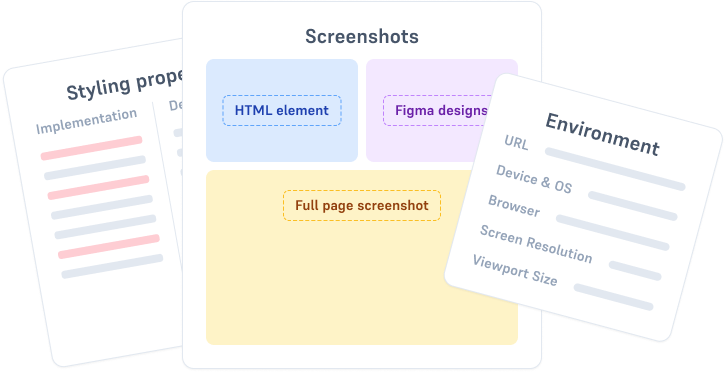
Yes! DesignQA offers a completely free plan that includes 50 bug reports & fixes, smart screenshots, automatic context extraction, and integrations with Figma and Linear. You can use it forever by deleting old bugs to make room for new ones.
What types of bugs can the AI fix?
DesignQA's AI excels at fixing CSS issues, layout problems, responsive design bugs, and accessibility issues. It can also handle functional issues if you provide enough context in your bug report. The AI is optimized for UI and layout-related fixes.
What frameworks and technologies does DesignQA support?
DesignQA works with any framework and automatically matches your codebase's coding style. It has special optimizations for popular stacks like Tailwind CSS and Next.js, but supports React, Vue, plain HTML/CSS, and any other web framework.
Can I review AI-generated fixes before they go live?
Absolutely! Every AI fix is submitted as a separate pull request in your GitHub repo. Anyone on your team with GitHub access—designers, developers, or managers—can review, modify, or reject the changes before merging them into your codebase.
What GitHub permissions does DesignQA need?
DesignQA requires read access to metadata and secrets, plus read and write access to actions, code, issues, pull requests, and workflows. This allows the tool to analyze your code and create PRs with fixes.
Is my code secure? Where is it processed?
Code analysis happens in the cloud. You'll provide your own API key for your preferred AI provider (like OpenAI or Anthropic), so you control which AI service processes your code. DesignQA doesn't store or train on your codebase.
Can multiple team members use DesignQA at the same time?
Yes! Multiple team members can report bugs simultaneously. When a bug is fixed with AI, the bug report updates to show a 'fixed' status and includes a link to the GitHub PR with the solution.
What happens when I hit the 50 bug limit on the free plan?
Once you reach 50 bug reports, you won't be able to create new ones until you delete older bugs. This frees up space and lets you continue using DesignQA for free indefinitely. Or you can upgrade to Individual ($10/month) or Team ($12/user/month) for unlimited bug reports and AI fixes.
Can I upgrade or downgrade my plan anytime?
Yes! You can upgrade or downgrade your plan mid-month at any time. Your billing will be prorated accordingly.
Do I need developers on my team to use DesignQA?
No! Solo designers and design-only teams can use DesignQA effectively. The AI creates PRs that anyone with GitHub access can review and merge. However, most teams prefer having developers review code changes before merging—that's entirely up to your team's workflow and permissions.
How does the AI-powered fix feature work?
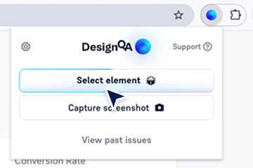
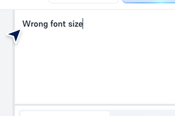
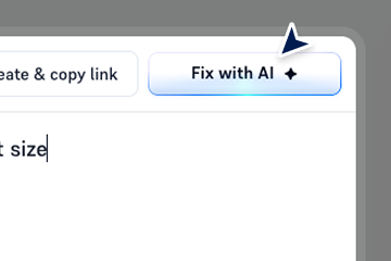
Simply select any element on a webpage, describe the issue, and click the 'Fix with AI' button. DesignQA's AI analyzes your codebase, generates a fix that matches your coding style, and automatically creates a pull request in your GitHub repo. The entire process takes seconds.
What if the AI fix isn't perfect?
Every fix is submitted as a GitHub PR, so you or your team can review, edit, or refine the code before merging. You have complete control over what goes into your codebase.
Does the AI learn from my fixes or feedback?
Currently, the AI doesn't learn from previous fixes or user feedback. Each fix is generated fresh based on your codebase and the bug description you provide. If there's enough demand, we may add learning capabilities in the future.
Can I use DesignQA with AI-generated websites (like Replit, Bolt, Lovable, etc.)?
Absolutely! DesignQA is perfect for anyone building with AI coding tools. After generating a website with tools like v0, Bolt, or Lovable, use DesignQA to visually identify and fix issues on your live site. Just point, click, and let DesignQA's AI create PRs with the fixes—no manual code editing required.
I'm not a developer but I build websites with AI tools. Will DesignQA work for me?
Yes! DesignQA is ideal for no-code builders and AI-assisted developers. If you've built a site using AI coding assistants or vibe coding tools and need to make adjustments, DesignQA lets you fix UI issues visually without touching code. The AI handles all the technical details and creates clean PRs you can merge directly.
What's included in the Individual plan ($10/month)?
The Individual plan includes everything in the free plan, plus unlimited AI-powered fixes, unlimited screenshots, and unlimited bug reports. It's perfect for solo designers or freelancers who want to ship fixes without waiting for developers.
What's the difference between Individual and Team plans?
The Team plan ($12/user/month) includes everything in Individual, plus team management features, bug report collaboration, early access to new features, and priority support. It's designed for design and development teams working together.
Can designers really push code to production?
Yes—if your team grants them GitHub merge permissions. DesignQA creates PRs that anyone with access can merge. However, most companies prefer having developers review AI-generated code before it goes live, which is why every fix goes through a PR workflow.
Does DesignQA work with private GitHub repositories?
Yes! DesignQA works with both public and private GitHub repositories. You control the permissions and access through your GitHub settings.
How do I get started?
Install the DesignQA Chrome extension, connect it to your GitHub repository, and start reporting bugs. You can use the free plan immediately. To unlock AI-powered fixes, upgrade to Individual or Team and add your AI provider API key.
What integrations does DesignQA offer?
DesignQA integrates with Figma and Linear in all plans. These integrations help you compare designs with live implementations and sync bug reports with your project management workflow.
Do I need to provide my own AI API key?
Yes, for AI-powered fixes, you'll need to provide an API key from your preferred AI provider (like OpenAI, Anthropic, or others). This gives you control over which AI service processes your code and ensures your data privacy preferences are respected.
